
Yarner Wood, Now & Then
I’ve downloaded air quality data for Yarner Wood, which is only a few miles from me on Dartmoor, from DEFRA. What can we do with it in R with Tidyverse? Can we see the effect of the current lockdown, which started on the 23rd March here in the UK, on this fairly rural location?
Let’s use tidyverse (for all sorts of goodness), lubridate (for date manipulation) and Rmisc (for multiplots):
library(tidyverse)
library(lubridate)
library(Rmisc)
I’m interested in how the air quality has changed compared to the same time last year, so I downloaded two data sets for Yarner Wood, covering the period 1st January to the 6th April in 2019 and 2020. I put the data into S3 for safe-keeping.
url2020 <- "https://extropy-datascience-public.s3-eu-west-1.amazonaws.com/data/airquality/yarnerwood06042020/AirQualityDataHourly-Yarnerwood-010120-060420.csv"
url2019 <-"https://extropy-datascience-public.s3-eu-west-1.amazonaws.com/data/airquality/yarnerwood06042020/AirQualityDataHourly-YarnerWood-010119-060419.csv"
First let’s grab it and put it into data frames:
yarnerWood2020Raw <- read.csv(url2020, skip=4, header=TRUE, na=c("", "No data"))
yarnerWood2019Raw <- read.csv(url2019, skip=4, header=TRUE, na=c("", "No data"))
Note that the data comes with several headers - metadata - which I’ve ignored. The data comes with hourly measurements for Ozone, Nitric Oxide etc.
Now let’s pre-process the data to convert the Date and Time columns into a standard DateTime format, and add day of year and week of year columns for comparison purposes.
yarnerWood2020 <- yarnerWood2020Raw %>%
  head(-1) %>%
  mutate(DateTime = ymd_hms(paste(Date, Time))) %>%
  mutate(DayOfYear = yday(DateTime)) %>%
  mutate(WeekOfYear = week(DateTime))


yarnerWood2019 <- yarnerWood2019Raw %>%
  head(-1) %>%
  mutate(DateTime = ymd_hms(paste(Date, Time))) %>%
  mutate(DayOfYear = yday(DateTime)) %>%
  mutate(WeekOfYear = week(DateTime))
Here’s what the raw data looks like for Ozone:
actual2019 <- ggplot() + geom_line(data=yarnerWood2019, aes(x=DateTime, y=Ozone)) + labs(x="Date", y="Ozone (ugm-3)") + ggtitle("Hourly Ozone measurements in 2019")
actual2020 <- ggplot() + geom_line(data=yarnerWood2020, aes(x=DateTime, y=Ozone)) + labs(x="Date", y="Ozone (ugm-3)") + ggtitle("Hourly Ozone measurements in 2020")
multiplot(actual2019, actual2020)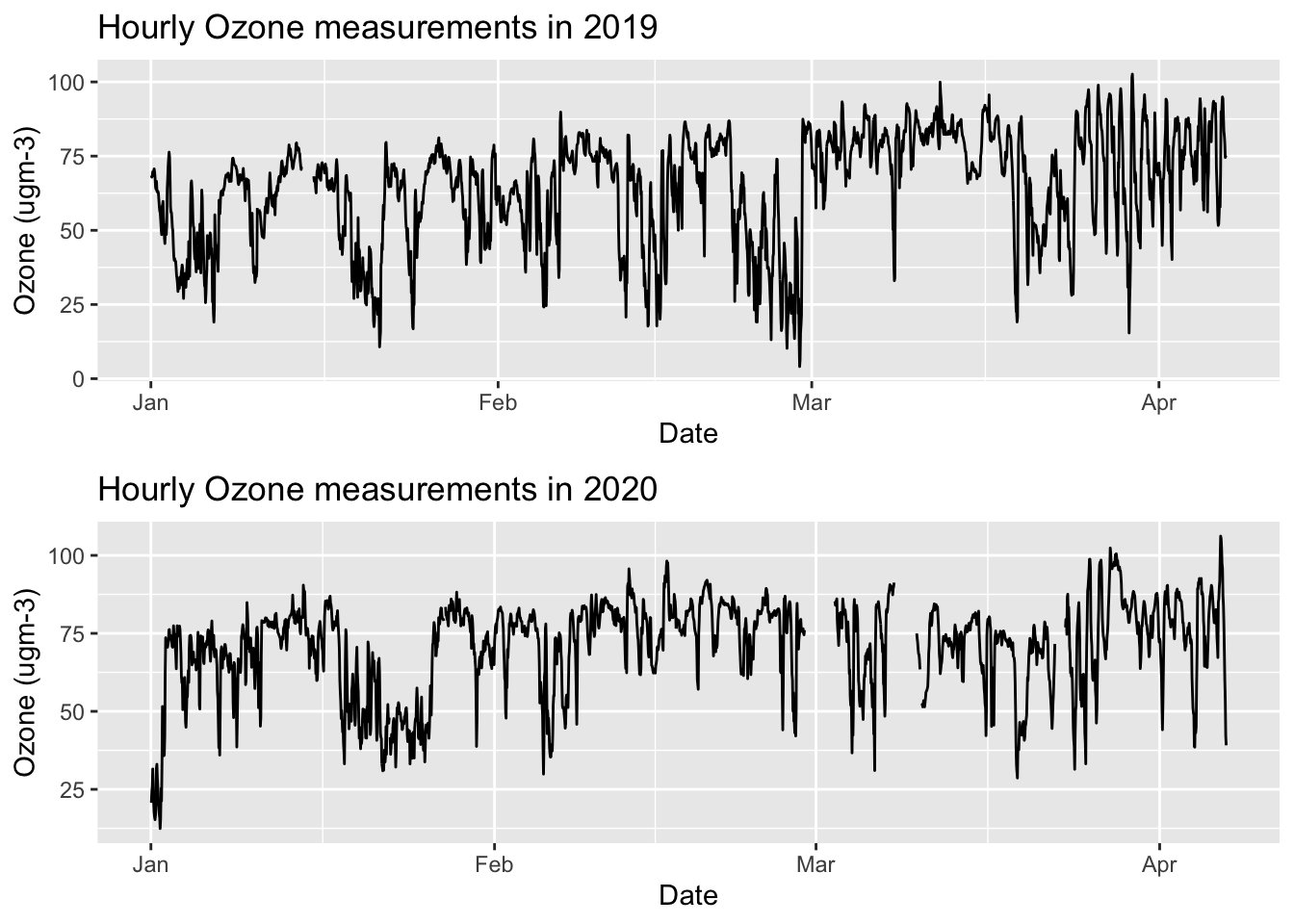
Note the missing data in 2020.
Let’s look at the daily average data for Ozone:
yarnerWood2019Daily <- aggregate(Ozone ~ DayOfYear, yarnerWood2019, FUN=mean)
yarnerWood2020Daily <- aggregate(Ozone ~ DayOfYear, yarnerWood2020, FUN=mean)
Let’s plot both averages (blue is 2020, grey is 2019):
ggplot() +
  geom_line(data=yarnerWood2019Daily, aes(x=DayOfYear, y=Ozone), colour="grey") +
  geom_line(data=yarnerWood2020Daily, aes(x=DayOfYear, y=Ozone), colour="blue") +
  labs(x="Day Of Year", y="Ozone (ugm-3)")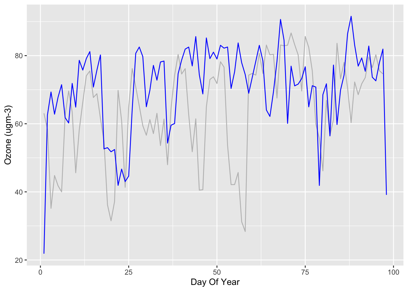
Let’s look at the weekly average Ozone:
yarnerWood2019Weekly <- aggregate(Ozone ~ WeekOfYear, yarnerWood2019, FUN=mean)
yarnerWood2020Weekly <- aggregate(Ozone ~ WeekOfYear, yarnerWood2020, FUN=mean)
ggplot() +
geom_line(data=yarnerWood2019Weekly, aes(x=WeekOfYear, y=Ozone), colour="grey") +
geom_line(data=yarnerWood2020Weekly, aes(x=WeekOfYear, y=Ozone), colour="blue") +
labs(x="Week Of Year", y="Ozone (ugm-3)")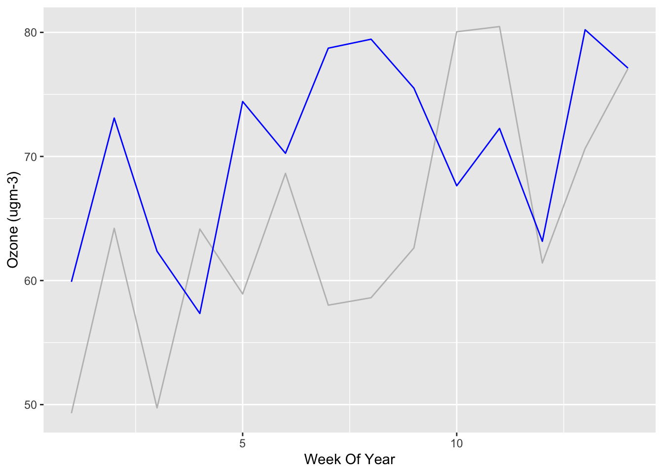
What can we tell from these graphs? Well, not much! Ozone is influenced by road traffic but depends on temperature, sunlight etc.
If we’re interested in the current short term effect of the lockdown then what would be interesting is the deviation from historic averages, perhaps that have been detrended to remove any long term trends. We could also compare them with measurements from more urban locations. This is what we’ll look at in the next post!
